KREO transforms your retail space from shopping to an experience, through the magic of innovative design.
In a merce, it is retail stores that take the biggest hit. An online presence that reaches out to millions with less than half the investment is tough to compete with, sooner or later, the humble retail store will find its place online.
Financially speaking, an online store is a sensible option for those looking to mass-produce or introduce a new line of products into the market. And why not? With the help of Social Media tools, you can find your entire target demographic with a click of a few buttons and have more effective results than if it were a face-to-face sale. But then how does a physical store score above the virtual one? And why, despite the huge potential of online options, do sellers still believe in paying rent for a space?
The answer is simple. Tangibility.
While you can only trust that the product you purchase on an e-store is of the highest quality based on its history and reviews, it is hard to know for certain. There’s nothing like carefully scrutinizing an item for hours and weighing its pros and cons. Nothing quite like an attentive sales rep who makes it their goal to gain your trust and more importantly, your loyalty. No feeling like being able to purchase an item and walk away with it on the same day knowing it will arrive home exactly the way it left the shop. There’s no guarantee like tangibility.
But, despite all its obvious benefits, we can easily see its slow dismantlement.
We at KREO, are not ready for them to shut shop just yet and have a simple formula we follow, to ensure that retail spaces become an interactive experience that customers have to see first-hand.
What’s our formula?
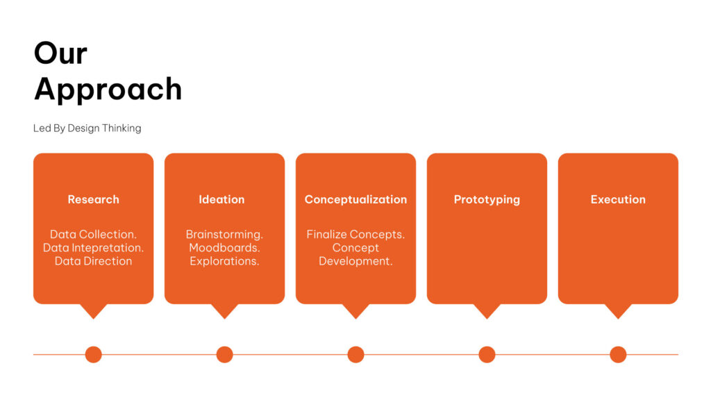
A few examples of where this formula proved to be successful in a big way:
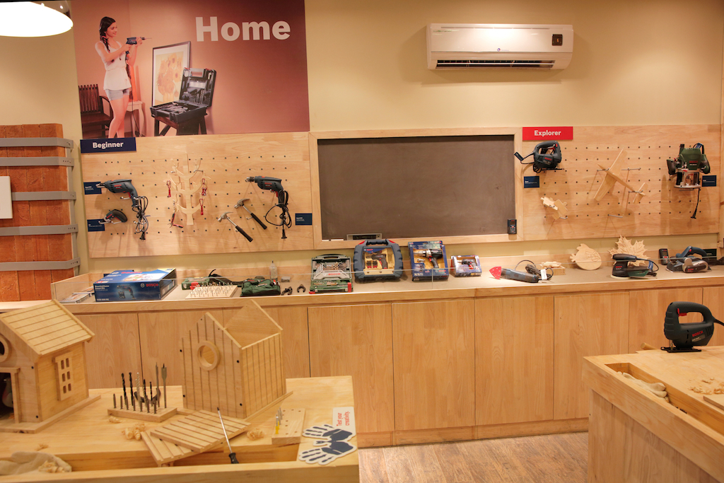
BOSCH DIY STORE
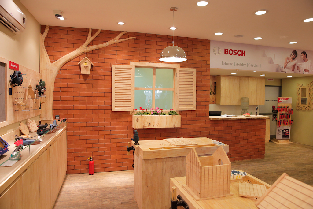
The new DIY store concept for Bosch was completely innovative and extremely experimental. The DIY concept elevated the brand to the level where it is more approachable and engaging to its customers. The space let the brand do the talking – from the big picture down to the last detail.
CROCS PORTABLE STORE
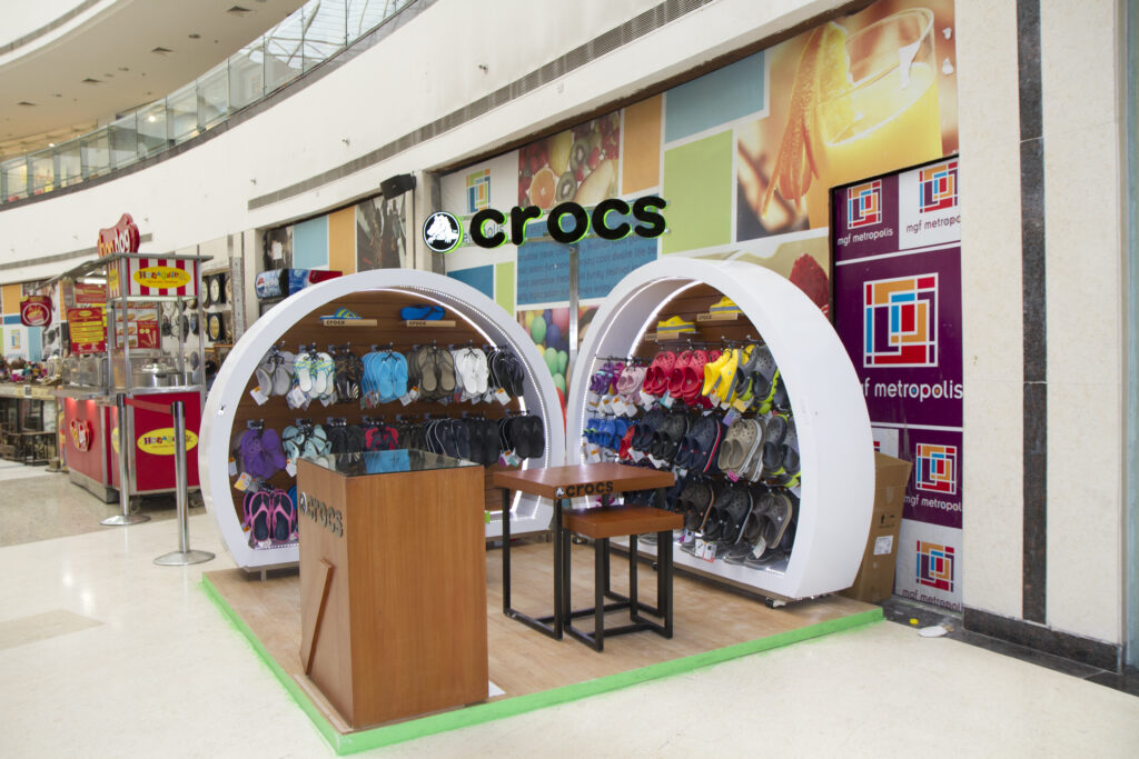
The challenge at hand was to design an 8 ft/8 ft shop-in-shop in the middle of the mall that could be shut at the end of the day. The idea was for it to reflect Crocs’ brand image while incorporating innovative features to give it a distinctive look, unlike anything available in the mall. The solution: A horse shoe clam design. A seamless open-shut mechanism, it allowed for the display of 250 pairs of Crocs. The convenience of the clam design ensured that there was no compromise in terms of functionality, enabling store runners to lock products away, conveniently until the next business day.
3 DOTS AND A DASH
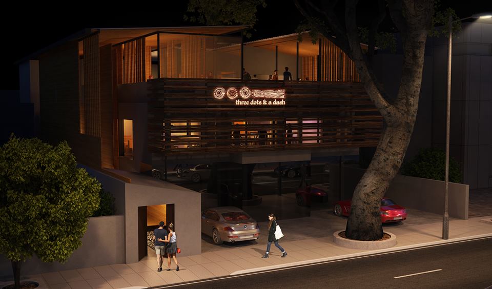
From coming up with a unique name to end-to-end branding solutions, our job was to establish a strong identity for the pub, that had a touch of KREO going for it.
The theme: Tiki.
Inspired from a drink created by Don The Beachcomber, one of the Tiki Legends from the early 1930s, its name was derived from the Morse code for the letter ‘V’, which represented victory during the World War. We evolved the design through the play of wood and today it stands out with its unique look and feel – Our tribute to the Tiki culture!
Leave a Reply